How One Dashboard Transformed a Clinic’s RCM Performance
🔍 At a Glance
Within just 60 days, this medical practice shifted from uncertainty to full financial clarity — not through more staff or software changes, but by finally seeing its data in one connected RCM + Business dashboard.
🚨 The Challenge: Hidden Leaks in a Growing Practice
💬 “We were submitting claims, tracking payments — yet we couldn’t answer: how healthy is our revenue?”
Key issues doctors faced:
- Delayed, spreadsheet-based reporting
- No visibility into payer mix or denial reasons
- Confusion between clinical and billing data
- 12% monthly revenue silently lost
🧾 Pain Point Visualization: (add a red-tinted graphic here — “Revenue Leakage by Category”)
→ Staff inefficiency (35%) | Delayed submissions (28%) | Denials (22%) | Others (15%)
💡 The Turning Point: Real-Time RCM + Business Dashboard
Instead of waiting for end-of-month reports, the clinic started viewing real-time metrics across three layers:
| Layer | Focus | Key Insights |
|---|---|---|
| 🧮 RCM Analytics | Claims, Denials, AR | Clean-claim % |
| 💰 Business Intelligence | Collections, Revenue Flow | Month-on-month growth |
| ⚙️ Operational Pulse | Staff Efficiency | Verification backlog |
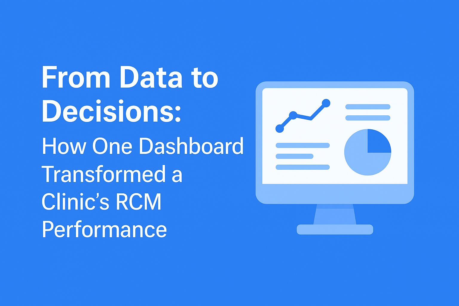
🖥️ Visual Placeholder: (Insert your dashboard screenshot here — label sections “RCM”, “Business”, “Operational Pulse” with light callouts)
“When we saw our denial ratio drop from 9% to 2% within a month, we realized this wasn’t just software — it was a mirror of our financial health.”
📊 The Results Speak for Themselves
| Metric | Before | After 60 Days | Impact |
|---|---|---|---|
| Clean Claim Rate | 86% | 97% | +11 pts improvement |
| Denial Volume | 1 in 11 | 1 in 45 | 4× fewer denials |
| Average AR Days | 43 days | 27 days | Faster cashflow |
| Provider Satisfaction | Moderate | High | Less billing stress |
| Financial Visibility | Fragmented | Unified | 1-click insights |
📈 Suggested Visual: Gradient progress bars (Before vs After)
(use blue for “Before” and green for “After”)
🧠 What This Means for Doctors
💡 1. Patterns Beat Guesses
Your denial and AR graphs tell a story — find them before they hurt your collections.
🩺 2. RCM Is Clinical Too
Just as you review vitals before a diagnosis, reviewing RCM vitals prevents financial illness.
📊 3. Dashboards Replace Meetings
Skip weekly billing reviews — you already know what’s working, and what’s not.
❤️ Before & After Snapshot (optional visual section)
Add a side-by-side comparison image or infographic:
Before: “Reports via email, data delays, cashflow confusion”
After: “Live dashboard, instant insight, confident decisions”
🧩 The Takeaway
Your EMR shows patient health.
Your RCM Dashboard shows practice health.
When both are connected, you gain a living financial pulse that predicts risk, empowers staff, and protects your income.
💬 Closing Thought
“Every doctor should be able to see their numbers like they see a patient’s chart — live, simple, and reliable.”
🚀 About Dr Billerz
At Dr Billerz, we help practices visualize their revenue, denials, and performance in real time — so you can make informed decisions without ever touching a spreadsheet.
📧 sumit@drbillerz.com
📞 +1 (313) 725-9746
🌐 www.drbillerz.com